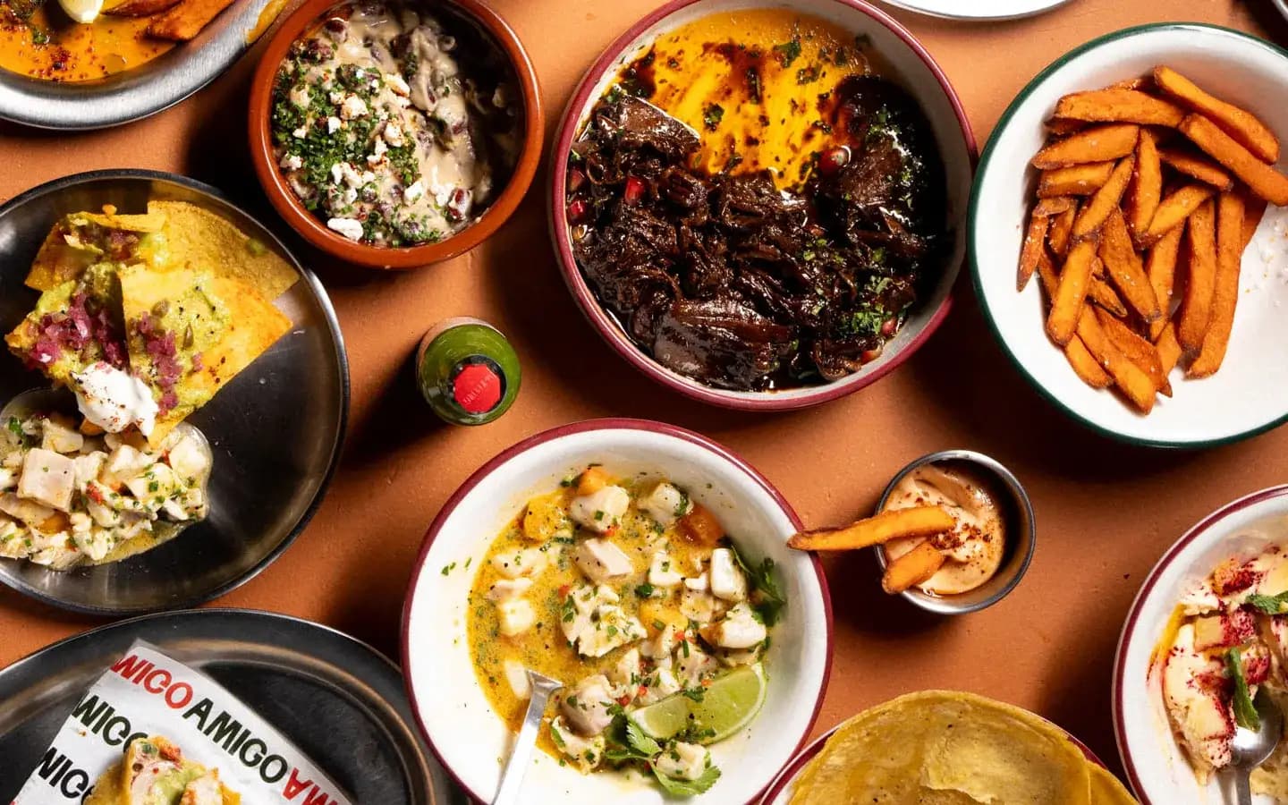
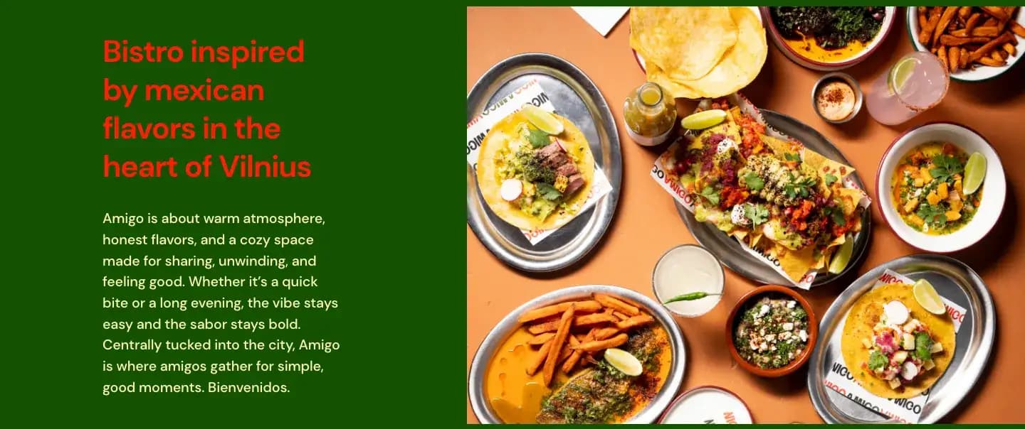
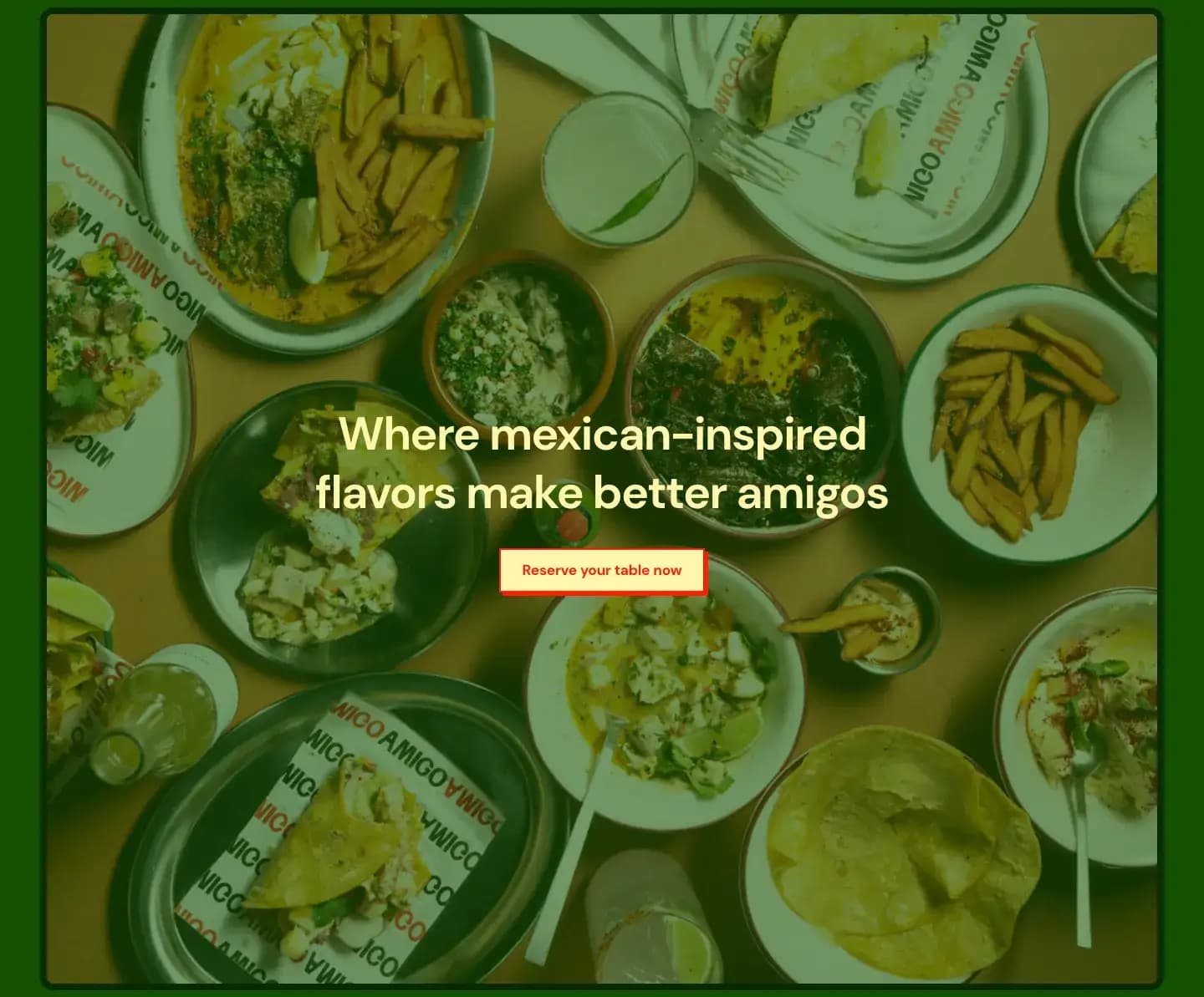
Green, red, and pale yellow run the whole page; every background is one of the three. Food is shot from above, tables loaded and mid-meal, and the photographs fill their frames rather than sitting in cards. What the page sells is a full table.
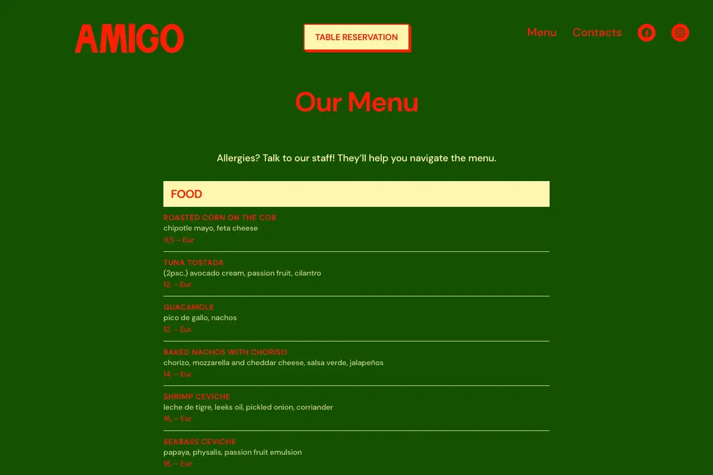
The menu is a straight, single-column reading list rather than a downloadable PDF. Tostadas, ceviche, tacos, and mains are laid out with clear pricing, dish descriptions, and a direct reminder to check allergies with the team.
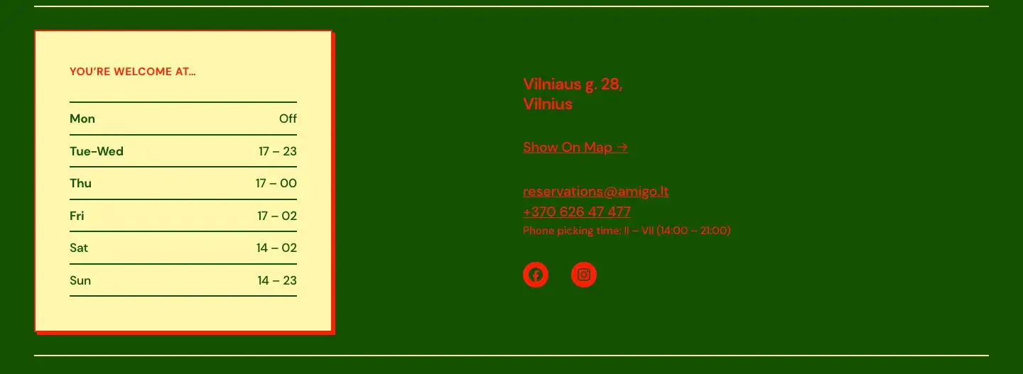
Booking appears twice: pinned in the header and again as a full-width prompt halfway down. Hours are a proper table, day by day, with the 2am close on Friday and Saturday spelled out. Underneath sit the address with a map link, the reservations email, the phone number, and the hours somebody actually picks the phone up, which saves the calls that go nowhere.
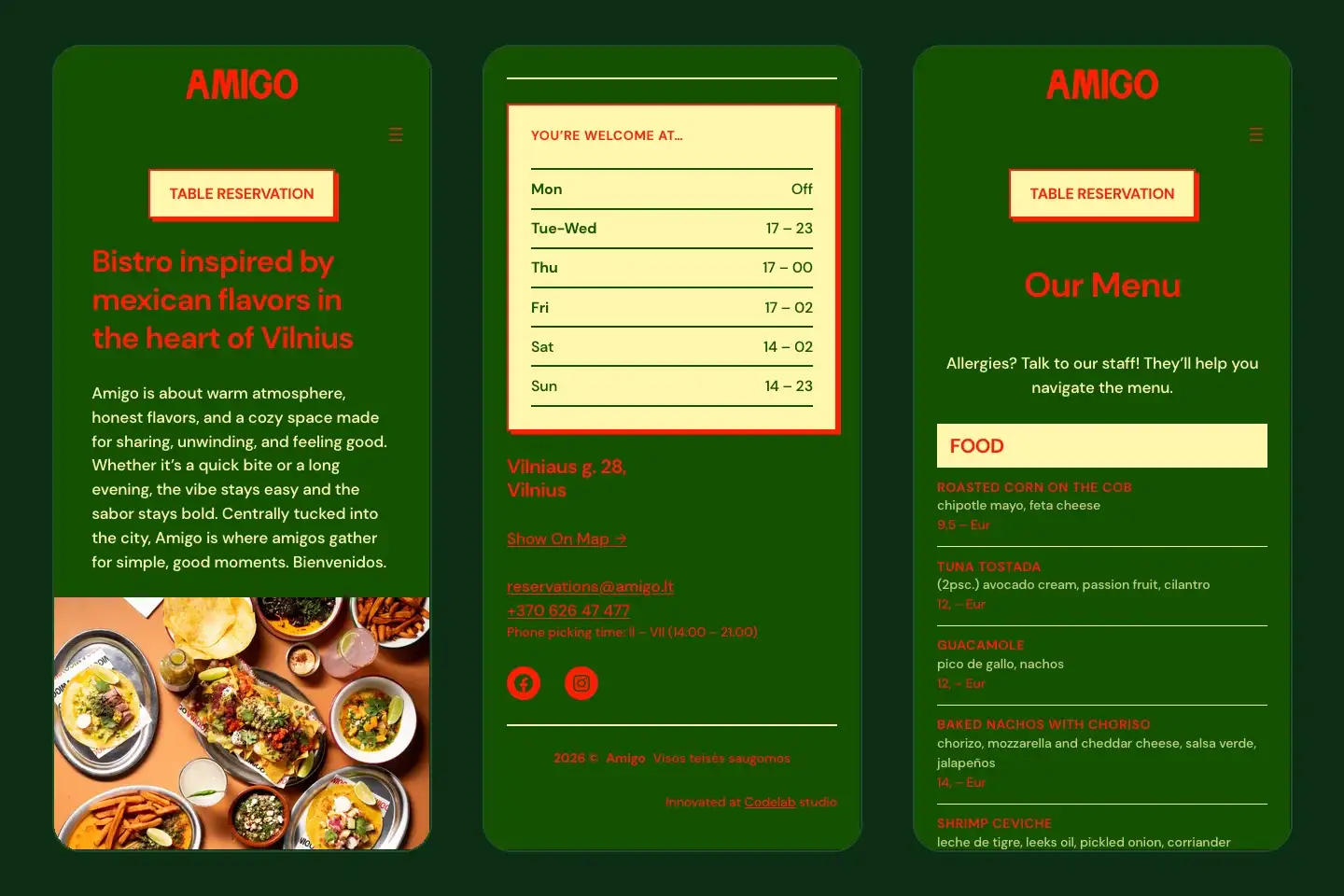
On mobile, navigation collapses to a flyout and the reservation button stays in reach. Reading through the dishes works on a phone, and so does checking the opening hours from the street outside.