
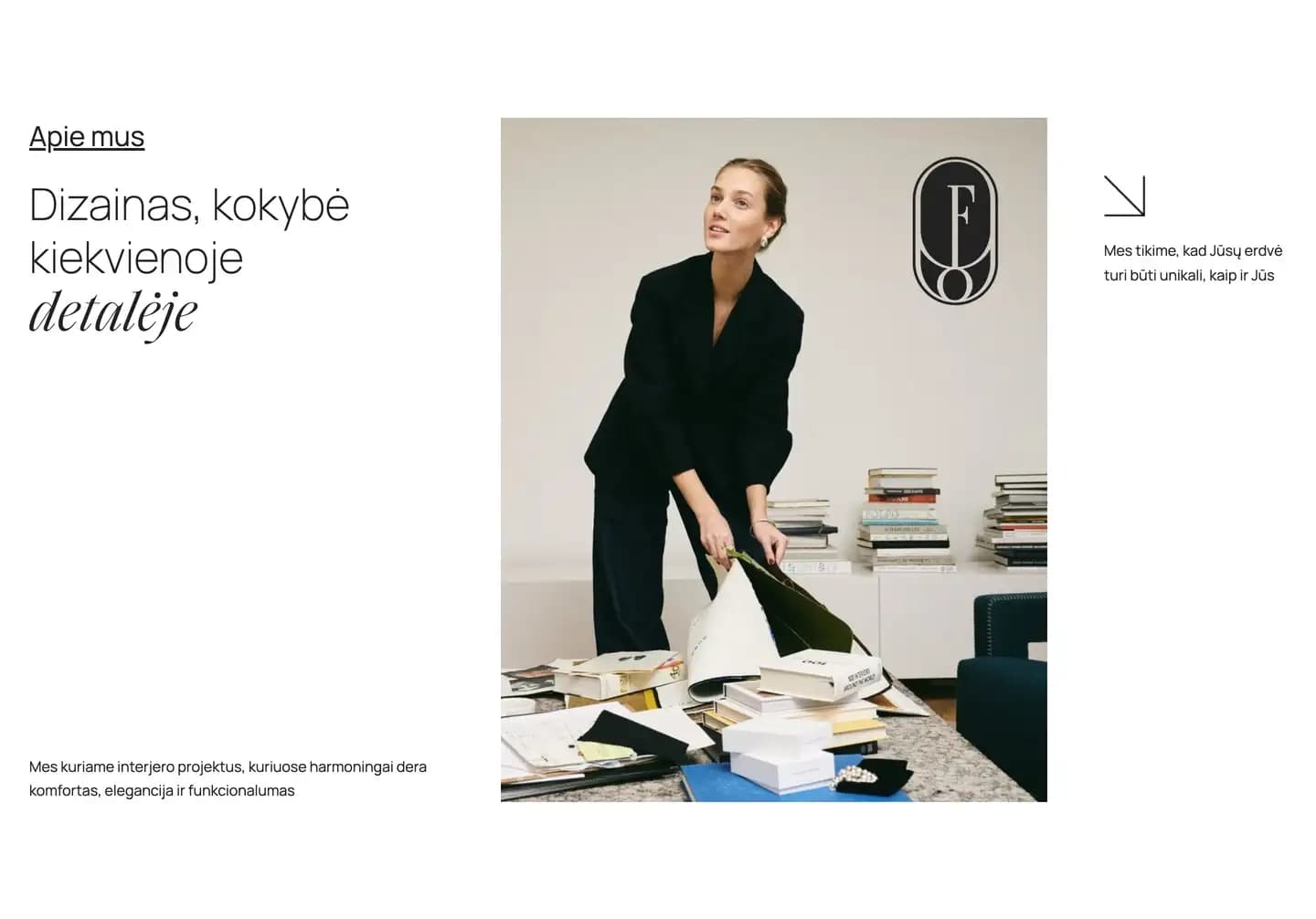
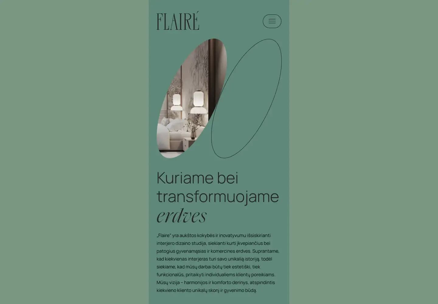
Interior design is sold on taste, so the site had to look like the work before it said anything about it. The identity's ellipse runs through everything: the wordmark, the mask on the hero photograph, the outline shape beside it, and later the pricing. A display serif carries the italic accents, a geometric sans takes everything read at length, and the palette is sage green, cream and near-black. Photography sits inside the ellipse, so it reads as part of the identity.
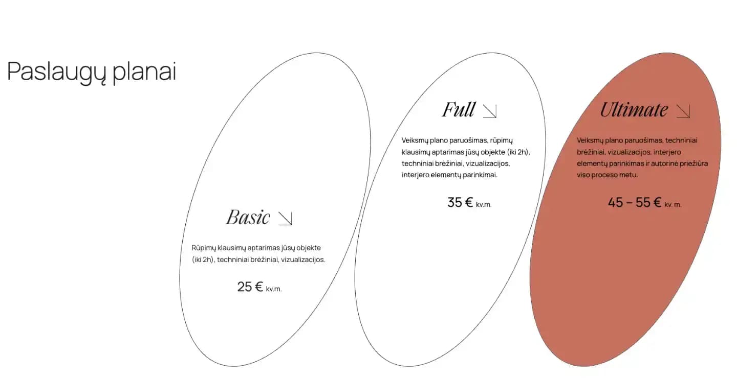
Most studios in this category quote on request. Flairé publishes: three tiers by square metre, each listing what it covers, from the site visit and technical drawings through to element selection and supervision during the build. That answers the question that would otherwise cost a phone call, and it filters enquiries before they reach the studio. We drew the tiers as overlapping outline ellipses, so the scope grows as the eye moves right and the reading stays about size.
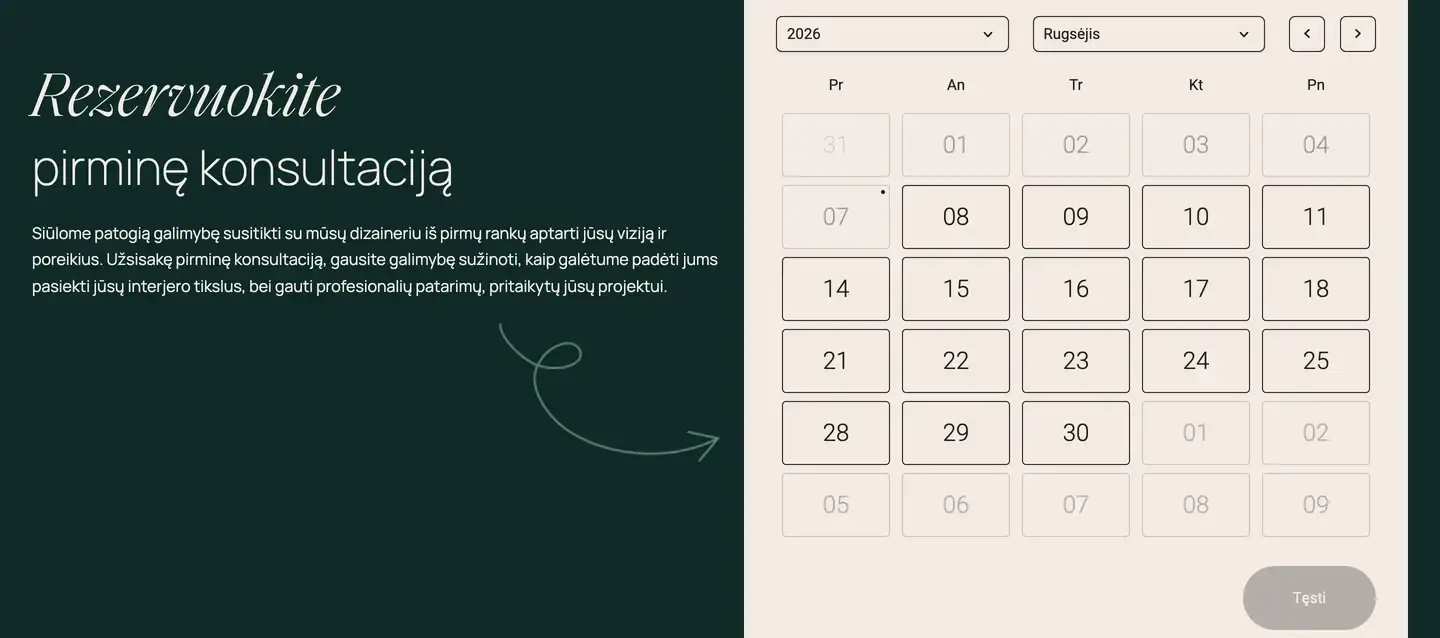
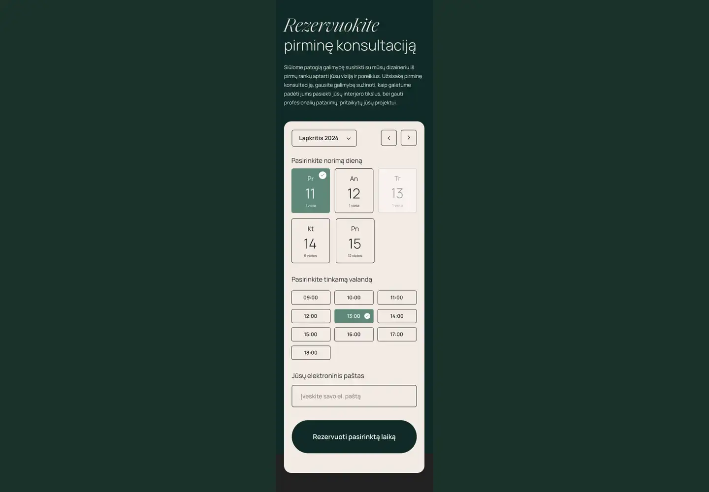
The consultation booking is the page's only real transaction, so it happens on the page itself. Pick a day, pick an hour, leave an email. The calendar shows working days and greys out anything past, and each day prints how many slots it has left, which is what moves a visitor from browsing to booking. Every route through the page ends there: the header button, the section link, the footer.